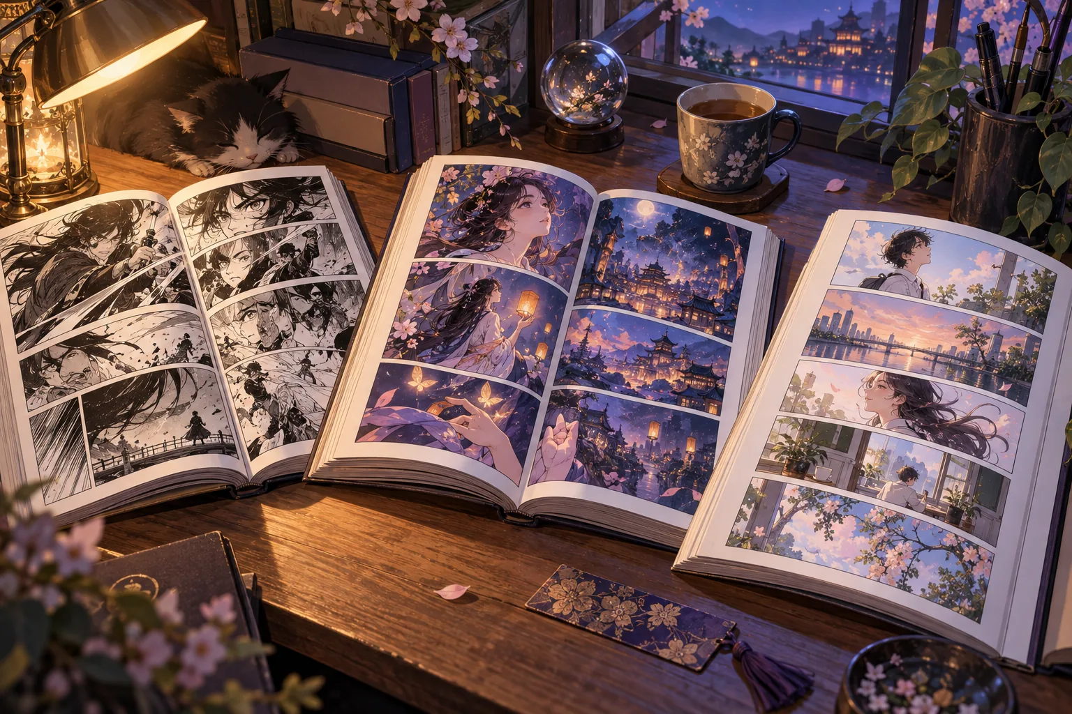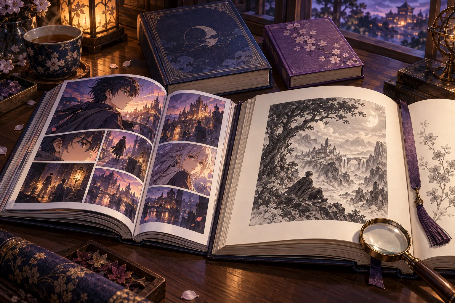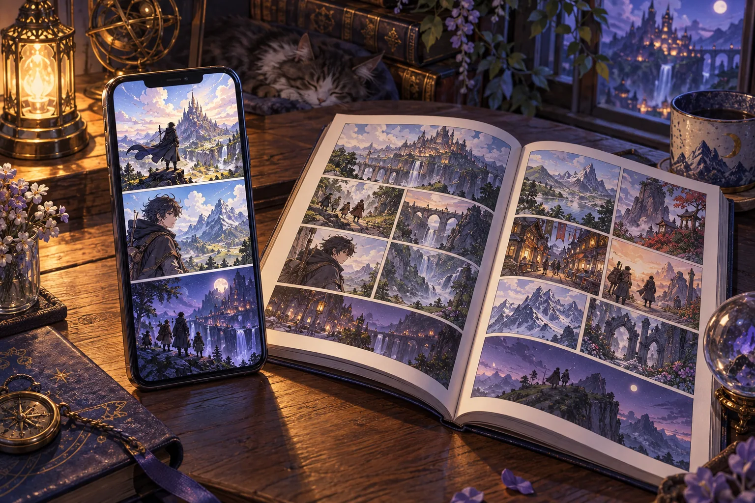
Two editions can present the same event and create different reading experiences. In one, you scroll until a face appears; in another, you see that face when you take in a whole page. Neither approach is automatically better. They organize information differently. When choosing between vertical manhua and a page-based edition, it helps to examine pauses, scale, and the route your eyes take through a scene.
Scrolling can turn empty space into waiting
A vertical sequence reveals a limited section at a time. The reader decides how far to move, while something outside the screen can remain hidden until the next gesture. The WEBTOON Creators Resource Handbook discusses spacing and the number of panels visible on screen as composition choices. Its guidance belongs to that platform, rather than establishing universal rules for digital comics.
Consider an invented scene: someone hears a noise overhead, looks up, and notices a silhouette. Separating those moments with space can make each scroll feel like a short wait. If the silhouette is visible beside the opening panel in another layout, the reader may know about the threat before the character does. The event is similar, but the information arrives differently.
Empty space can therefore contribute to storytelling. That does not mean every long gap achieves the same effect. Ask whether it extends an emotion, clarifies movement, or interrupts the sequence without adding much. This gives you a more useful measure than equating screen length with the number of meaningful events.
A printed page invites a broader view
A page makes several images available at once. You can follow its intended order, but also glance back at an earlier expression without much movement. A layout can connect separate moments through their position, emphasize an image through its size, or encourage a comparison between two reactions.
A page turn provides another way to withhold information. In the imaginary silhouette scene, placing the reveal after the turn can preserve surprise. That does not make it identical to scrolling: the size of the reveal and the physical action required are different. A designer has to decide where the reader should pause.
To compare two presentations, first identify what you knew when the scene began and what you knew when it ended. Then notice when each important detail arrived. This small exercise shows whether a version speeds up discovery, makes rereading easier, or encourages you to linger over an image.
Digital does not necessarily mean vertical
A digital edition may present fixed pages in a reading app, a sequence designed for scrolling, or another arrangement. A product listing does not always explain this clearly. Open a sample on the device you intend to use and check whether reading dialogue requires constant zooming or sideways movement.
Manhua does not dictate a single physical format either. Planeta’s Spanish listing for Heaven Official’s Blessing specifies a print edition and Western reading direction. Seven Seas lists the dimensions of its second Grandmaster of Demonic Cultivation manhua volume. These are details of individual editions, not characteristics shared by all Chinese comics.
What to inspect when a comic changes presentation
If samples of both versions are available, compare a conversation and a movement-heavy scene. Check whether dialogue retains a clear reading order, important images remain large enough, and transitions still make sense. A changed arrangement is not automatically a flaw. Adapting material involves choices, and the useful question is whether those choices support the scene.
Remember the limitations of promotional images. A double-page spread compressed into a small screenshot can seem unreadable even when the physical book is comfortable. Conversely, an enlarged marketing image does not prove that lettering will look good on your phone. Try to approximate your actual reading conditions.
Our guide to official editions and translations explains how to check which version a listing represents. Chapter coverage and additional material should be confirmed for the specific edition rather than inferred from its title.
Choose through a short, practical reading test
Read a conversation, return to an earlier panel, and find the point where you stopped. Judge legibility, orientation, and how easily you can resume. If an action creates repeated friction, the format may not suit you even when the artwork interests you. A beautiful preview and a comfortable reading experience are related, but separate considerations.
You can prefer your phone for one comic and collected pages for another. There is no requirement to choose a single format permanently. For concrete starting points selected around different interests, see how to start reading manhua by tone and format.